

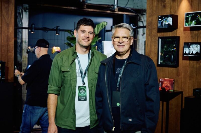
In celebrating Xbox’s 25 year anniversary, we to the time to chat to them about their design choices for each Xbox console, and just what goes into making them fun and unique, yet an important piece of the same console family.
Hi, Carl and Chris. Just want to say a huge thank you for taking the time to chat with us here at the AU Review. I was a PlayStation kid growing up, but had always been around the original Xbox. Playing Halo multiplayer of cousins and friends. Very iconic memories at that console. I did get the original Xbox 360, another iconic design and have pretty much had every Xbox ever since.
The Xbox consoles over the past 25 years have certainly changed from a design perspective. But what do you believe, apart from the logo, keeps them connected? Or what do you look to bring across with each new console design?
Carl: Yeah, well, I’ll start there. I think there are a few things, and it kind of gets to the way we design Xbox consoles and controllers and the ethos around the design of them. But I’d say every generation of console that we design, we really tried to create a bold expression.
And starting with the Xbox 360, we really wanted to create a product that could fit in anybody’s home. And so multiple orientations like vertical and horizontal matter; we really want it to be able to stand out as much as somebody wants to, so they can celebrate the design, or it can sort of recede into the build. The home, like, into the background, so it doesn’t become obtrusive. The other thing we wanted to do is reflect each generation. Like each generation, we have new games, we have new technical capabilities and the quality of experience you’re going to get. So just like when we evolved the functionality of the controller and the ergonomics of the controller, we try to equally match the way the console looks, feels, and performs. So, those are some of the things we think about, but it’s every console; we want it to be bold and expressive, uniquely Xbox, and even though I know we said no logos, the logo has changed, like from the OG logo to the 360, which on the front just had a power icon and the ring of light. But on Xbox One, we brought in the Xbox brand and made that a touchpoint. And to this day, we still use that.
The Series X and Series S obviously share similarities, but they also have their differences, as you know, as far as their designs are concerned. What goes into that process when you’re deciding how to either marry or differentiate the pair?
Chris: Yeah, great, great question. So I was the lead designer on both those consoles. Obviously, nobody does anything on their own in a company like Xbox. We have a design team. We work really closely with the mechanical engineering team. And really, the first six months or eight months of any console program is. is the design team working with the engineers to really optimise the architecture, the shape, the kind of silhouette of the product. And so what we do for each one, for the X and the S, is we really tried to optimise that size to get it, like Carl mentioned, into a really flexible form factor. So. We wanted each one to have a very small footprint. It gives you more places that you can put it on a shelf or in your home. And we don’t want to ever package in, you know, open space inside a console. And so we’re really considerate about how we arrange the components inside to get a well-proportioned, as small as possible compact design. And so with the Series X, by far the most powerful console we’ve ever made, you know, really big power supply, huge heat sink. We did something really creative with the wipes splitting the motherboard so that we didn’t have to have that. A very large surface area that allowed us to orient it vertically and create a really nice compact footprint that, you know, fit into a square naturally. And so this created this kind of two-cube stacked proportion, which was like kind of underlying geometry that, you know, we don’t talk a lot about, but it’s visually pleasing. And so, you know, it was really cool to be able to arrange the components in the console into that proportion because it works really well. And so the architecture really relies on this axial fan pulling air through the whole system. And so it naturally wants to be vertical. It evokes sort of like a chimney if you’re moving heat up and out the top. And so we played up on the very top surface, the venting in there, and that became like the focal point.
With the Series S, on the other hand, where we did not have a disk drive, it was slightly lower powered in terms of the power supply unit that goes internally in there. So it let us make the smallest Xbox console we’ve ever made. But we did want it to be familiar. We also wanted it to be a bit different and have its own personality to appeal to a different set of customers. So we were really intentional about keeping one of the dimensions the same. So if you look at the depth of the two products, it’s exactly 151 millimetres. We tried to get it to 150 because it was a nice round number, but the engineers needed a little bit more wall thickness on one of the walls. We’re at 151, but if you put them next to each other, you know, they have that relationship, but then, by doing the CMF, the colour material finished differently. We added, it’s a, you know, primarily white with that black circle that contains all the exhaust venting on it. We created, like, a really bold and iconic silhouette and something you could draw on like a Post-it note. That’s kind of one of like the litmus tests we do is like, can you express that design in a simple line drawing and kind of get the essence of it across? And so with that like well-proportioned rectangle and circle, you kind of get that right away that it’s the Series S. It’s really about optimising the components inside, picking a couple of those design elements, like, so the circular vents they’re arranged differently on the two products, but we, you know, we’re really intentional about using the same vent shape and that depth proportion where you know you put them next to each other. They match; it just naturally feels like they go together, but they each have their own personality. So we’re really intentional about optimising the interior architecture and then letting each console have its own personality while still sharing some of those same common elements.
What lessons have you applied from previous consoles into the Series X and Series S or even look to bring to new hardware moving forward?
Chris: Yeah, one thing I mentioned in that last question was the footprint, making sure that it was as compact as possible. And that was, we know that that’s really important because we go out and we talk to customers. During the development of the Series S&X, we took kind of black box models that didn’t have all the details, but we were about the right size. We took them into customers’ homes. We said, like, hey, where would you put this? Like, does it fit? Does it integrate into, like, the furniture that you have and where you keep your other stuff that’s attached to your TV? And we went into, you know, cities around the US. We did some international studies. So we’re really looking at, like, how can we make this fit into the way that people live? And so traditionally we had done, you know, a flatter, like a set-top box type shape, but we know that that could be eliminated if you don’t have a deep enough shelf, you know, because you’ve got plugs coming out the back, et cetera. And so one of the things that was important to me as we were developing these was to keep that footprint as small as possible because it just…
It gives you flexibility in terms of where you put the console in your house, because you know that’s ultimately where it lives, and we want people to, like, integrate it into, you know, into the stuff that they already have, and we want it to work for them.
Carl: So a couple of things that we’ve learned, like what have we learned from the past? Two things sort of stand out in my mind. So on Xbox One, we launched it with a capacitive touch button on the front. And I can’t tell you, it didn’t show up in testing, but once we launched the product, we started having these stories about, you know, the dog would come by and wag its tail and… and turn off the console and the gameplay. It’s like, okay, let’s note that. So, yeah, so let’s not do that anymore. So, but in general, it was like, how do we simplify the controls so that they’re tactile and obvious and easy to get to? So that’s really, really important when we design consoles, and we optimise for that. We also are very intentional in the way that the controls are lit. So, like the backlighting on the Xbox button, when you look at the controller in the console, they have this family feel. And then also the sound. You know, if you don’t want sound, of course you can turn it off, but the sound becomes really important as a… as an indicator of starting the experience. So we’re very intentional in creating those sound effects. And then there’s a nice thing that we can roll into that, and that is, over time we’ve learned that special editions like the 25th anniversary console, that X25 console. Designing products that can be morphed into other things, whether it’s game IP or anniversary moments or things like that, is really important. So as we continue to design consoles, we factor that in, and the controller. So that’s dividing fans with special and limited editions is a big part of what we do. And that’s something that we’ve really embraced into our ethos of design.
Chris: Yeah, that’s actually a great point. We do think of, as we’re designing the core line of products, like the controller and the console, it is now a part of our process to think of that as like a canvas for what we can do in the future and make sure, you know, from like a surface area perspective and from the radius that we put around the button openings that you can, like, you know, wrap a pad print around that, and we want to give our team like the most flexibility in the future to do all of these cool limited edition controllers that we know are super popular and that’s like a real hallmark of the brand. I love it. It’s a way to celebrate fans as well.
If both of you had to pick just one, just one, what would your favourite design feature be on the Series X?
Carl: I’ll start, but that’s tough. I’m going to talk about some of the functional things, as Chris talked about the proportions, because it’s a square. The Series X is a square form factor. It actually is very shallow when you put it on the shelf or, you know, inside of a cabinet or something like that. So what I really love this about it, and that is when people plug and unplug, HDMI cables, power cables, things like that. The Series X, it’s super easy to get to it, whether it’s in vertical or horizontal configurations. And the other thing is, in that frame, once you lay it, the design is really optimised for vertical; it’s very heroic. You know, and it stands, it feels very monolithic. But if somebody wants to lay it down, you know, it performs equally well. But if you look at the bottom of the console, it just looks good in either orientation. So that, combined with the access to the plugs in the back, is my favourite feature.
Chris: For me, it’s not a hard question. It’s definitely the top surface. As we’re designing products, whether it’s a console or a controller, we’re really conscious about every detail that we put on it. And so the Series X does not have a lot of extra details. You know, we resist adding, you know, sculptural elements if we don’t have to, but on this top surface it’s a super functional element, so air needs to flow through this from the fan to, you know, to cool the SOC and through the heat sink, and it needs that to function well, and so what comes along with that is a certain amount of open area. And so, we were always working with the thermal engineers to kind of find that right balance of open area versus plastic that, you know, can be moulded. And, as we were thinking about this top surface, you know, we really landed on making that the heroic moment on the device. And so, you can see when you look at one, it’s got a concave surface. And the depth of the holes as you go across that surface changes. So they’re shallower in the middle; they’re deeper on the side. And we added a layer of green underneath those holes. And so what’s really cool is that it’s actually like a bit of an optical illusion. So as you change your angle of view, looking at that vent surface there, at first, it appears all black, and then as you raise your eye level, you see this green kind of bloom from the centre of it. And it’s this really cool expression of the brand. And then this was a bit of a happy accident, but with the X25 console, when we made the console in translucent plastic for the first time, you actually get that magnified even more because you’re getting light refracting through the translucent plastic, and it’s doing like things, you know, differently than we even expected. And it was like a really happy accident. But that, like that surface, the depth of those holes was like very difficult to engineer. And so we were really intentional about making that, like, a feature on the product that was really visually exciting and then letting the rest of it sort of be quiet. And like Carl mentioned, fitting into homes and not being an uninvited guest in someone’s living room.
Thanks again to both Carl and Chris for taking the time to chat; it’s been a pleasure.
